A border style to look like a button.
A neon glow menu.
A right border change on :hover.
Text movement on :hover.
Border art to indicate the link on :hover.
Additional link text on :hover.
A shadow added on :hover.
Indented text on :hover.


Value | Description |
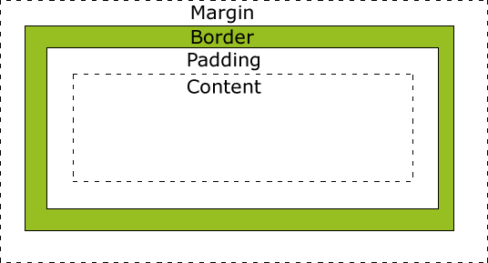
length | Defines a fixed padding (in pixels, pt, em, etc.) |
% | Defines a padding in % of the containing element |
| Common Names | Rare Names | |||||
| ! | exclamation mark bang pling excl not shriek |
| ||||
| " | quotation marks quote double quote |
| ||||
| # |
|
| ||||
| & | ampersand amp amper and and sign | address reference andpersand bitand background pretzel | ||||
| ' | apostrophe single quote quote |
| ||||
| ( ) | opening / closing parenthesisleft / right paren left / right parenthesis left / right open / close open / close paren paren / thesis | so/already lparen/rparen opening/closing parenthesis opening/closing round bracket left/right round bracket wax/wane parenthisey/unparenthisey left/right ear | ||||
| [ ] | opening / closing bracketleft / right bracket left / right square bracket bracket / unbracket | square / unsquare u turn / u turn back | ||||
| { } | opening / closing brace open / close brace left / right brace left / right squiggly left / right squiggly bracket/brace | brace / unbrace curly / uncurly leftit / rytit left / right squirrelly embrace / bracelet | ||||
| < > | less / greater than bra / ket left / right angle left / right angle bracket left / right broket | from / into (or towards) read from / write to suck / blow comes-from / gozinta in / out crunch / zap tic / tac angle / right angle | ||||
| * | asteriskstar splat |
| ||||
| - | dash hyphen minus | worm option dak bithorpe | ||||
| . | perioddot point decimal point | radix point full stop spot | ||||
| / | slash stroke slant forward slash | diagonal solidus over slak | ||||
| \ |
| bash reverse slant reversed virgule backslat | ||||
| : | colon | dots two-spot | ||||
| ; | semicolon semi | weenie hybrid pit-thwong | ||||
| = | equalsgets takes | quadrathorpe half-mesh | ||||
| ^ | circumflexcaret hat control uparrow | xor sign chevron shark (or shark-fin) to the fang pointer | ||||
| _ | underline underscore underbar under | score backarrow skid flatworm | ||||
| ` | grave accent backquote left quote left single quote open quote grave |
| ||||
| | | bar or or-bar v-bar pipe vertical bar | vertical line gozinta thru pipesinta spike | ||||
| ~ | tilde squiggle twiddle not | approx wiggle swung dash enyay sqiggle (sic) |
@font-face {
    font-family: 'ChunkFiveRegular';
    src: url('fonts/chunkfive.eot');}

 h1, h2 {
    font-family: ChunkFiveRegular, Georgia, serif;}
HTML:
<h1>Briards</h1>
  <p>The brie is a large breed of dog traditionally used as a herder and guardian of sheep.</p>
<h2>Breed History</h2>
<p>The briard, which is believed to have originated in France, has been bred for centuries to herd and to protect sheep.</p>font-size – no more thought required. Sizing with keywords is more complicated and requires a few workarounds, but you’re in luck as the techniques are well documented. That leaves ems. At this point people often leg it. ‘Ems are too inconsistent,’ they say, ‘they’re too hard; they never work.’ Well that may be the received wisdom, but if ever the was a case of FUD then this is it. I will now attempt to show you how ems can be as quick and easy to use as pixels.BODY {font-size:62.5%}<body>
<div id="navigation"> ... </div>
<div id="main_content"> ... </div>
<div id="side_bar"> ... </div>
<div id="footer"> ... </div>
</body>
#navigation {font-size:1em}
#main_content {font-size:1.2em}
#side_bar {font-size:1em}
#footer {font-size:0.9em}H1 {font-size:2em} /* displayed at 24px */
H2 {font-size:1.5em} /* displayed at 18px */
H3 {font-size:1.25em} /* displayed at 15px */
H4 {font-size:1em} /* displayed at 12px */INPUT, SELECT, TH, TD {font-size:1em}16 x 0.625 = 10child pixels / parent pixels = child ems
12 / 10 = 1.224 / 12 = 2#main_content LI {font-size:0.8333em}10 / 12 = 0.8333LI LI {font-size:1em}LI LI, LI P, TD P, BLOCKQUOTE P {font-size:1em}child pixels / parent pixels = child emsResource from: http://clagnut.com/blog/348/


